
Uncategorized
How Maps Quietly Shape How You See the World
Jan
Maps feel factual. Almost harmless. They hang in classrooms. Sit inside phone apps. Guide flights, shipping routes, weather forecasts, even military planning. We treat them as neutral. As if they’re simply reporting reality. They aren’t.
Every map is a set of decisions. What goes in the center. What gets pushed to the edges. What looks large. What quietly shrinks. Most of the time, we never notice those choices. But they still work on us.
This is where maps quietly mess with us.
The One Problem No Map Can Solve
The Earth is round. Maps are flat. That’s the whole problem. Everything else follows from that.
Try peeling an orange and laying the peel flat on a table. You can’t do it cleanly. Something has to stretch. Something has to tear. The Earth behaves the same way when you try to flatten it. So every map cheats. A little or a lot.
Shapes bend. Areas lie. Distances get strange. Directions stop behaving the way your intuition expects. None of this means maps are bad. It just means they are compromises. Useful compromises. But compromises all the same.
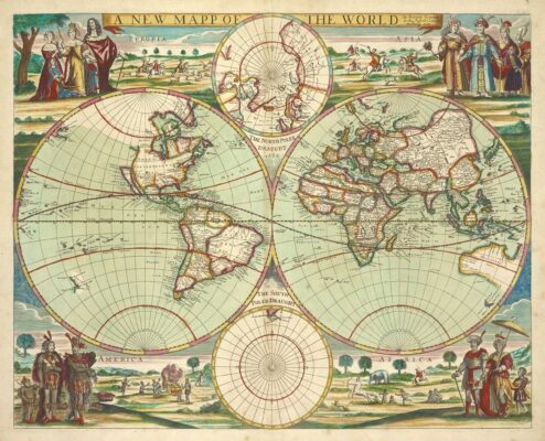
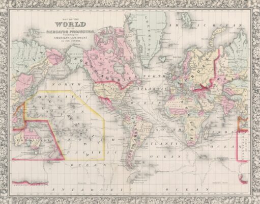
Why There Isn’t Just One “Correct” World Map
A map projection is simply a rulebook. It defines how the Earth is flattened and which truths get preserved.
Some projections are built for navigation. They keep angles accurate so ships and aircraft can follow consistent bearings. Others focus on land area, making sure continents appear in their true proportions. Some care about distance. Some about direction. None of them show everything perfectly. That would be impossible.
The real problem isn’t projections. It’s pretending one projection is the world, instead of one interpretation of it.
Greenland, Africa and a Visual Lie You’ve Seen Your Whole Life
Greenland looks huge on many world maps. Almost the size of Africa. It isn’t even close.
Africa is roughly fourteen times larger. The illusion happens because many common projections stretch land near the poles. The higher the latitude, the more exaggerated the size.
This distortion doesn’t just confuse trivia nights. It subtly shapes how we perceive importance, power, and scale. Big on the map often feels important, even when it isn’t.
That bias slips in quietly. Most people never question it.
Why North Is “Up” (And Why That’s Arbitrary)
North being at the top of maps feels natural. It feels correct. It’s neither.
There is no universal up in space. Maps can be oriented any direction. South-up maps work just as well. East-up maps have existed for centuries. Pacific-centered maps make more sense for much of the world.
North ended up on top largely because European navigators standardized it during an era when Europe held disproportionate power. The convention stuck. The worldview stuck with it.
Flip a map upside down and watch how uncomfortable it feels. That discomfort is learned, not logical.
Maps Have Always Been Political Tools
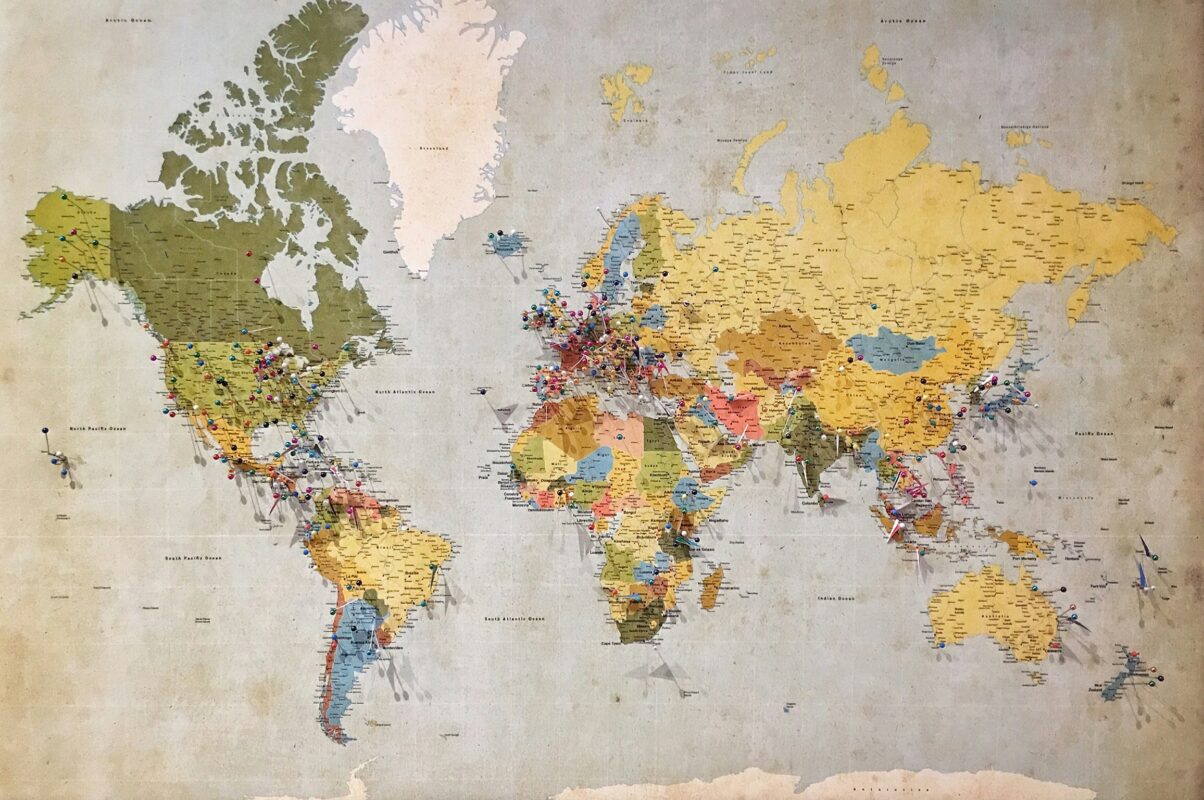
Maps have never been passive. They’ve been used to claim land, define borders, sell empires, and simplify complex realities into something easier to control. Even today, digital maps make decisions about which borders to emphasize, which names to use, and which places deserve visual weight.
Those choices matter. Especially when politics, identity, and conflict are involved.
Understanding maps means understanding power. You can’t really separate the two.
When Maps Stopped Being Pictures
Modern maps aren’t static images anymore. They’re systems.
You can layer elevation, climate, population, infrastructure, and time itself. Turn things on. Turn things off. Ask “what if” questions and actually see the answers.
This changed geography from something you memorize into something you use. Suddenly, maps weren’t just for classrooms. They were tools for planning, forecasting, logistics, and decision-making.
Once you experience that, flat paper maps feel incomplete.
Why Geography Still Matters (More Than People Admit)
Geography isn’t about listing capitals or coloring worksheets.
It’s about understanding why things happen where they happen. Why cities grow where they do. Why climates behave the way they do. Why supply chains snap in one place and not another.
In a global world, spatial thinking isn’t academic. It’s practical. And increasingly, it’s a competitive advantage.
What Geography.biz Is Trying to Do
Geography.biz exists because geography deserves better than rote learning.
The goal here is simple. Make geography visual. Make it hands-on. Make it something you interact with instead of memorize. Tools, games, physical products, and writing that treats the reader like an adult who’s curious, not a student cramming for a test.
Near the end, a quick rhythm shift:
-
Tools you can actually use
-
Maps that explain instead of decorate
-
Products that make geography tangible
Once You Notice How Maps Work, You Can’t Unsee It
Maps stop being background noise.
They start feeling intentional. Sometimes helpful. Sometimes misleading. Always influential.
Understanding maps doesn’t just make you better at geography. It makes you better at reading the world. And once you have that skill, it sticks.
That’s the whole point.